Kubrick模板创建了无数的精美博客,预计今年年中这款主题将会退出WordPress默认主题的行列。
在互联网的世界中,不论是多么重要的创新,它的生命周期还是很短的,虽然对于Kubrick来说,它曾经算是非常完美。
自从2005年,年轻的丹麦技术奇才迈克海勒曼(Michael Heilemann)在他位于哥本哈根北边的农场创作出这个简单蓝白色的博客模板后,它迅速成为WordPress不可缺少的一款主题。
“我渴求美的东西,”他最近在一次圣莫尼卡的午餐上说道,“我着迷于简单的事物。”

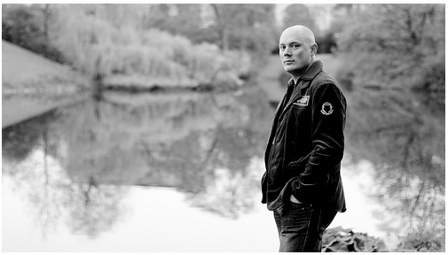
迈克海勒曼Michael Heilemann
迈克海勒曼着手写博客时,互联网上满是各种各样的日记项目,几块文本加上偶尔布局难看图片就可构成。而他制作的模板完全不一样的,优雅大方并且富有创新。Kubrick首次亮相以来,彻底改变了网络空间的样子,它使得图片和文字以创新和不断改进的方法融合在形形色色的博客中。它使得原本只是作者自以为是、沉闷、仅热衷自己个人想法的一个博客成为了互联网上全球社区分享关于设计、时尚、美学的一个地方。
关于库布里克(Kubrick)主题,这其中还有一个鲜为人知的的背景故事:
科技奇才,迈克海勒曼现在31岁在哥本哈根从事视频设计的工作,在配置新的博客模板的几个月的时间里,他通过DVD观看了著名导演Kubrick 的《2001遨游太空》。他的设计代码是这样开始的:
*/ / * Begin Typography & Colors */ body { font-size: 62.5%; /* Resets 1 em to 10 px */ font_family: 'Lucida Grande'....
带着些许幽默,海勒曼最后引用电影《2001遨游太空》的歌曲来结束代码。
/* "Daisy, Daisy, give me your answer do. I'm half crazy all for the love of you. It won't be a stylish marriage, I can't afford a carriage. But you'll look sweet upon the seat of a bicycle built for two." */
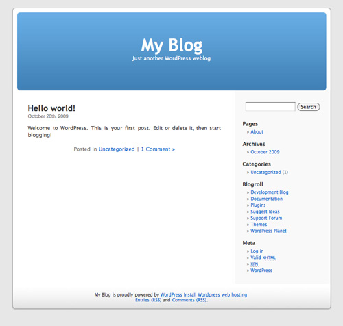
海勒曼的博客设计在当时是非常出色的,以一个自定义的蓝色标题的头和白色的两栏设计,其中较宽的一栏用于发布文章,另外一各较小的栏用于显示目录和其他有用信息。海勒曼依靠灰色背景为衬托。在WordPress登场的几个月里,Kubrick模板已经成为了博客世界里的大家公认的旗手。

Kubrick主题
“他有那种把东西当成画布一样的眼光,”WordPress的创始人马特·穆伦维格(Matt Mullenweg)说,“这是一个适用于任何类型博客的设计。”
这个模板出现在互联网的各个角落,被使用成千上万次,被认为是博客动态历史的展示。(海勒曼将这个主题免费发布到WordPress上,他开玩笑说:“如果它每被人使用一次我有一美元的收入,我现在都成为一个富翁了。”)
虽然只有那些非常专心致志的博客设计师才可能知道Kubrick主题的起源,知道原始代码歌颂了好莱坞导演这个故事。
"不管从哪一个角度看《2001遨游太空》 都是一部非常有远见的电影"海勒曼说道,?"它里面有一种超越其他任何电影的东西。"
给该主题命名为Kubrick,应该算是纪念导演的一个非常好的方法,虽然海勒曼还有一些保留。他说,"我讨厌别人用谷歌搜索'Kubrick (导演)找到我的主题。"
为什么他要添加19世纪的歌曲"Daisy Bell"中的歌词到代码中?
"它是哈尔电脑死在人类手下时所唱的歌。我相信看过库布里克《2001遨游太空》的人的人应该会知道。"
Kubrick这款主题的最大贡献就是它使得网络空间更加接近它最初一贯的想法。网页设计师和理论家们关心互联网出版的民主化很长时间了,网络给任何有电脑的人平等的机会。虽然直到人们有了笔记本,大家可以像传统媒体一样设计和包装他们的作品,有了所谓的出版民主。万能的WordPress结合优雅的 Kubrick 主题使得这一切成为可能,使得出版的民主化从理论变为一个现实。
几乎自WordPress创建以来无论谁注册WordPress账户,这款主题都是他们的默认主题。去年有传闻说WordPress设计师筹划撤销Kubrick默认主题, 因为与耀眼的新主题(加上缩略图、图片展示)相比,显得有点陈旧,最近, WordPress官方证实了传言。
"当2005年,Kubrick主题与WordPress核心捆绑一起时,还算是非常尖端的主题。" WordPress 开发者Jane Wells 在博客上写道2010主题遨游. "自定义头部,圆角,整洁的设计,如果你那时在使用WordPress,你肯定会有非常深刻的印象。 ?随着时间的消逝,潮流在变,新的样式变成土了,曾一度算是前沿的东西立刻变得守旧和过时了。"
创始人马特·穆伦维格说他计划每年更换一次WordPress默认主题,以保持跟着潮流走。
当被问及Kubrick主题即将退席,海勒曼(Heilemann)说:"也是时候了!"
原文: The Secret History of Kubrick, the Blog Theme That Changed the Internet
Kubrick, the template that launched millions of beautiful blogs and helped transform the Internet, is expected to?be retired mid-year as the default theme for the popular WordPress blogging platform.
The half-life of any innovation in the virtual world, no matter how important, is short -- though in Kubrick's case, it's been a happy life.
It's been the fallback theme on the rapidly growing WordPress since 2005, when young Danish technology whiz Michael Heilemann created the simple blue and white blog template at his family farmhouse north of Copenhagen.??
"I wanted something with a nice aesthetic," he said over lunch recently in Santa Monica. "I was drawn to simplicity."
 Michael Heilemann (Photo courtesy Rikke Andersen)
What once was the realm of the opinionated, the pensive and the merely self-absorbed now has become a place where a global community shares thoughts on design, fashion and pure aesthetics.
As with many game-changing innovations, this one has a little known -- and fascinating ?-- backstory:
A sci-fi buff, Heilemann -- now 31 and working as a video game designer in Copenhagen -- watched Kubrick's 2001 on DVD during the months while he was configuring the new blog template. His design code started out like this:
*/ / * Begin Typography & Colors */ body { font-size: 62.5%; /* Resets 1 em to 10 px */ font_family: 'Lucida Grande'....
With a clever and dry sense of humor, Heilemann ended the code with an invisible note that referenced Hal the computer's final refrain in 2001: A Space Odyssey:
/* "Daisy, Daisy, give me your answer do. I'm half crazy all for the love of you. It won't be a stylish marriage, I can't afford a carriage. But you'll look sweet upon the seat of a bicycle built for two." */
Heilemann's blog design was striking (for its time) with a custom blue header and two white columns, a wide one for posts and slimmer one for a table of contents and other useful information. Heilemann set it off against a gray background. Within months of its debut on WordPress, Kubrick had become a standard-bearer in the blogging world.
 ?The Kubrick Theme
The template, which has spanned thousands of knock offs in every corner of the Internet, is considered a piece of the blogosphere's dynamic history. (Heilemann, who released Kubrick to WordPress as a free download, jokes: "If I had a dollar for every time it was used, I would be rich.")
Yet only the most devoted blog designers know about the origins of Kubrick or the fact that the original code carried an ode to a Hollywood director.
"2001 is just a visionary film in every single way," Heilemann said. ?"There's something about it that transcends every other film."
Naming the template Kubrick "seemed like a cool way" to honor the director, although Heilemann still has some reservations. "It seems almost blasphemous," ?he said. "I would hate for someone to Google 'Kubrick' and find my theme."
Why did he add the lines from the 19th century song "Daisy Bell" to the code?
"It's the song Hal the computer was singing while it was dying under the hand of man. I figured those who had seen Kubrick's 2001 would get it. ?I also figured anyone who had gotten that far in reading the code should be rewarded with something."
Perhaps Kubrick's biggest contribution is that it has brought cyberspace closer to the realization of one of its earliest and most consistent ideals. Web designers and theorists have long talked about the democratization of publishing on the Internet, the fact that the web puts anyone with a computer on an equal footing with the elite that traditionally has owned the?printing presses.?In?many ways, though, it was?a meaningless democracy until the people with laptops had the?ability to design and to package their work in the same way traditional media has always done.
The combination of the elegant?and versatile WordPress and the ground breaking Kubrick?made that possible, turning the democratization of?publishing from an idealized concept?into a concrete reality.
Almost since its inception, WordPress has issued the template as the default for everyone who signs up for an account.? Last year rumors surfaced that WordPress designers were contemplating retiring Kubrick as the default template because it looks, well, dated, compared to the flashy new themes with their thumbnail galleries and sliding photo shows.?Recently, WordPress officials confirmed the rumors.
"When Kubrick was bundled with core back in 2005, it was a cutting edge theme," WordPress developer Jane Wells wrote recently on the blogging platform's new page, 2010: A Theme Odyssey. "Custom header, rounded corners, clean design... if you were using WordPress back then, let's face it, you were impressed. Time moves on, though, fashions change, new styles become old standards, and what was once cutting edge suddenly seems old-fashioned and out of date."
Mullenweg said WordPress plans to change its default theme once a year, just to keep things fresh.
When asked about Kubrick's impending retirement, Heilemann said:? "It's about time."
Heilemann has moved onto other things too. In addition to creating video games, he also has a striking black and white blog called Binary Bonsai in homage to the Japanese and Chinese art -- Asian spirituality is very big among young web folk around the globe -- of cultivating naturalistic, but miniaturized trees.
"In the same way as with the current design of the blog, I wanted the name to be something I had to live up to," he said, "I chose Bonsai because a bonsai tree is a living thing, which needs nourishment and cultivation to thrive. You can steer a bonsai's growth, but you aren't in control of the bonsai itself. All of which was applicable to the idea of blogging.
"And Binary of course, because it's online, because it's nice to say, but also because together, the two words are opposites. Binary is hard, technical, mathematical, calculated, controllable and Bonsai is the opposite; human, living, poetical, lyrical, chaotic."
That would describe the web as well, though it's now a far more beautiful chaos because of Kubrick -- and its modest Danish creator.


